So Many Options : Layout Accent Two Ways
Tags: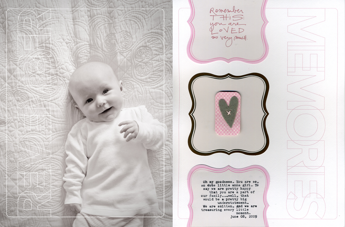
VERSION ONE [ click for larger version : photo © she saw things ]
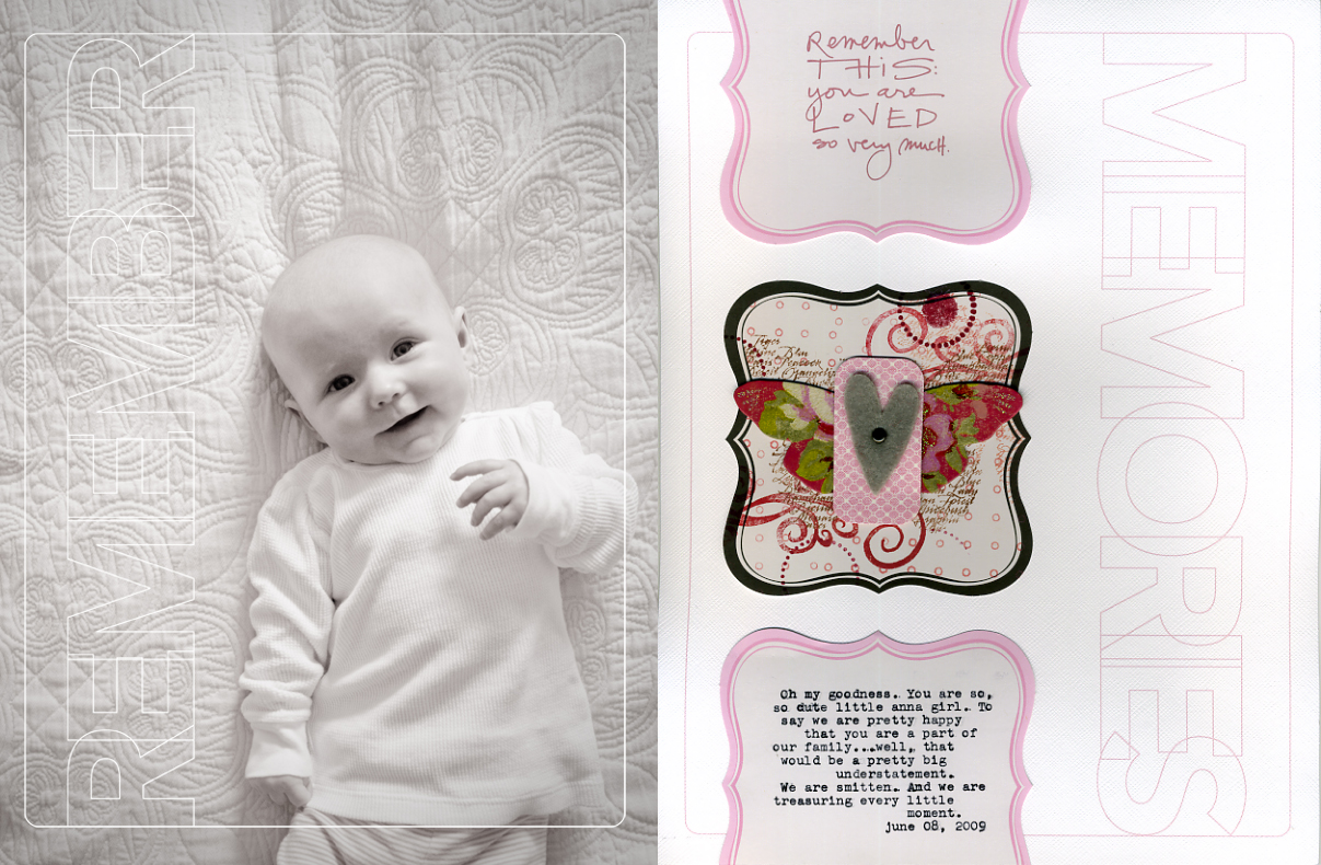
VERSION TWO [ click for larger version : photo © she saw things ]
My Studio A column in the July 2009 Creating Keepsakes (available now) talks about the endless options for background papers when creating layouts and telling your stories. It addresses the fact that there is no right or wrong choice in this process. Some people prefer cardstock, some patterned paper, some solids, and some prints. It's all about personal preference.
As you have probably noticed by now, I tend to have a personal preference lately for white cardstock backgrounds.
I was thinking about all these choices as I previewed Heidi's Tuesday Tutorial video and was inspired to create a second version of the center accent for the layout you see above. The top one is super simple and was how I originally created the page. The
second includes stamping and a chipboard butterfly under the felt heart accent - this one came about after watching the video.
One of the things I have always loved about scrapbooking is that there is so much variety. I love the chance to learn from other people, to see what they are doing, and be inspired to try something new. Sometimes it's a new technique, other times it is a way of jouranling, and other times it's the whole package someone presents when telling their story.
The next time you approach a project or layout I invite you to take a step away from your own personal comfort zone and go in a direction that is different from what you normally create. Modifying an accent like the one here is a very safe way to experiment and mess-around a bit without the fear of "wrecking" your whole layout.
Here's a look into the process of creating this layout:
1. In your photo editing program add the 8.5x11 Remember Outline Word Overlay to your photo. For a tutorial on recoloring overlays go here or here. Print at home or upload to your photo developer. I printed this one here at home on my HP Photosmart D7360 using the borderless printing option (works awesome right to the edge of the photo paper).
2. Print a second 8.5x11 Remember Outline Word Overlay onto a sheet of white cardstock. This will be the foundation for your content on the second page. For a tutorial on recoloring overlays go here or here.
3. Print the Remember Sentiment Stack word art onto the Jenni Bowlin Mini Die Cut Label Paper. To do this I ran a sheet of computer paper through the printer first, saw where the image/text was going to appear, and then temporarily adhered the die cut on top and ran it through the printer again.
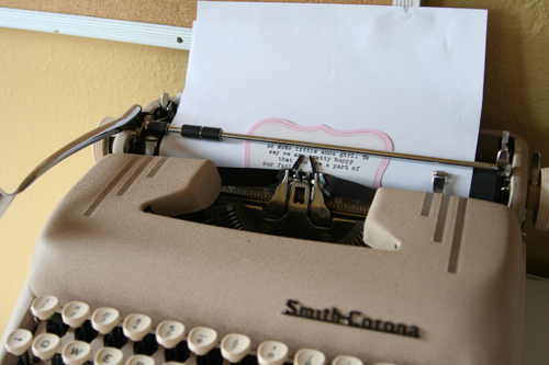
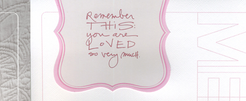
4. Add journaling to one of the die cut label pieces. Hand-write, stamp, run it through your printer, etc. For this project I used my old typewriter and again temporarily adhered the Mini Die Cut Label Paper onto some basic computer paper to make it go through easier. I love using this old typewriter.
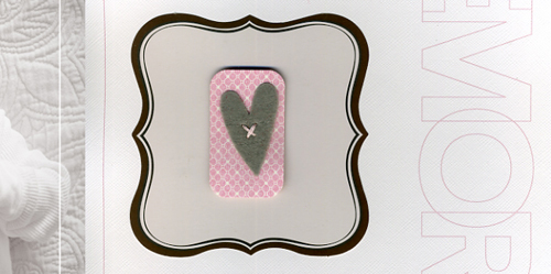
5. Now this is where the creative choice came in for me on this layout. Super
simple or more decorative & messy? For the simple option I just used some pop dots to adhere a
small rectangle of corner-rounded Making Memories patterned paper and a felt heart.
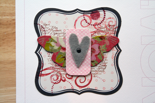
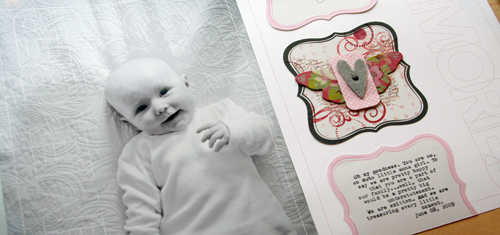
For the decorative option I
decided to follow Heidi's lead and group a bunch of stamping together
on top of the mini die cut label paper. I used a couple different
colors of ColorBox fluid chalk ink from this set. I topped the stamping off with one of the chipboard butterflies (that I can't seem to get enough of from K&Company) and the same felt heart/patterned paper combo as the simple option.
In the end I like them both. The second is definitely more bright & fun & artsy than the first. Some days I feel like creating that way and other days the perfect accent is the simplest option.
SUPPLIES : Bazzill Basics Cardstock; Jenni Bowlin Mini Die Cut Label Papers; 8.5x11 Remember Outline Word Overlay by Ali Edwards for Desginer Digitals; Remember Sentiment Word Stacks by Ali Edwards for Designer Digitals; Jenni Bowlin Felt Heart; Making Memories Patterned Paper; K&Company Chipboard Butterfly;
Wednesday Sponsor Giveawaysare moving to the weekend. They will now run from Saturday morning through Sunday late afternoon with winner's posted on Sunday evening.
A very warm welcome my newest sponsors Susannah Conway, Scrapista, Blue Moon Scrapbooking, Renee Pearson Digital Training, JBS Mercantile, and House of 3.


Comments
Sign in or sign up to comment.
35 comments
Ali. I adore this new feature. And Anna, obviously.
Replies
Sign in or sign up to reply.
She is such a button!!
Replies
Sign in or sign up to reply.
I can't believe how much Anna has grown! Actually picked up my copy of CK recently, and loved the way you incorporated the 1 layout/2 ways. Just so you know, you inspire me! :D
Replies
Sign in or sign up to reply.
I recently bought an old typewriter at a yardsale to print on my journal tags but a few of my keys aren't working. Need to get it fixed but will probably cost me a lot more than the $3 I spent on it...lol. Anna is beautiful, as usual :)
Replies
Sign in or sign up to reply.
Honestly could Anna be any cuter??? What a smile! She really looks like the spittin' image of you. I love the second layer with it's flirty little butterfly and pop of color. Love it!
Replies
Sign in or sign up to reply.
what a beauty! i love both layouts...the butterfly is especially pretty.
Replies
Sign in or sign up to reply.
Love how you can create simple and have it look stunning!...it helps when we are drawn to Anna - she is so precious! Personally, I LOVE what you did on the 2nd layout die...lots of work for such a little accent but worth it!
Replies
Sign in or sign up to reply.
I love the texture the quilting creates. As usual, simple and elegant. :-D
Replies
Sign in or sign up to reply.
This layout is amazing...I love it both ways! And I have to tell you that I was so inspired by your column in CK this month...just read it yesterday and was really inspired to scrap again...something I haven't done in months now. Thank you!
Replies
Sign in or sign up to reply.
precious. I love the butterfly and the use of the old typewriter.
Replies
Sign in or sign up to reply.
I love both layouts. The first is simple and the second is playful. Also, that is a beautiful picture!
Replies
Sign in or sign up to reply.
I love both of them- of course it really helps that the photo is just so adorable! What a happy little girl!
Replies
Sign in or sign up to reply.
Thanks for this inspiring post Ali. I like to use my typwriter sometimes too. It just feels good to poke those keys and get a fun noise. Thanks for all the inspiration.
Replies
Sign in or sign up to reply.
Thanks for this post. I used to enjoy stamping so much, but now the simpler, cleaner side of things is what I prefer.
Replies
Sign in or sign up to reply.
I like both layouts but tend toward number 2. The extra color adds just enough interest without taking away from the subject...who, by the way is an absolute doll! Thanks for the great post....bonus tutorial for the week!
Replies
Sign in or sign up to reply.
I totally go through phases...been leaning towards the cleaner side too.
Replies
Sign in or sign up to reply.
Wonderful! They are both great, but my fav is #2! Anna is getting so big and still as cute as ever!
Replies
Sign in or sign up to reply.
Cool Linn - so happy to read this!
Replies
Sign in or sign up to reply.
I like that you used an old typewriter... and you're right about scrapping and variety.. always amazes me how people come up with different things using the same stuff!! :)...
Replies
Sign in or sign up to reply.
Wonderful photos of Anna, she is adorable and getting so big...
Replies
Sign in or sign up to reply.