Week In The Life™ 2015 | First Steps In Creating An Album
Tags: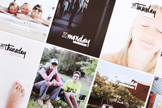
Now that we've collected some photos and words (or at least the photos) for Week In The Life™ it's time to begin bringing them together into a tangible album.
People approach this process in a hundred different ways. Some people like to give a little space and time between documenting the week and putting their album together. Others like to dive right in and finish it up. My general approach is to work on it very soon after completing my week but sometimes, like last year when December Daily® was so close, it just isn't possible. Know that it's okay whenever you end up putting it together. There is often a real beauty that comes from waiting and separating yourself a bit from the content - different stories emerge when you look back vs. when you are documenting in the moment. There's also a beauty that's very evident in doing it right away - the stories and photos are fresh and top of mind and your enthusiasm for the project may still be moving you forward.
Whatever you decide to do it will be awesome, because what's really awesome is what you've captured from your life the last week.
As for me, my album will be photo and word-centric much like my approach in 2014. I guess you could say I'm not ready to let go of that style just yet (and many other projects I do include more product play). I also like seeing similarities in design as well as content from last year.
Another great resource as you are getting started is my Working On The Album post from last year. Lots of ideas and tips and things to think about.
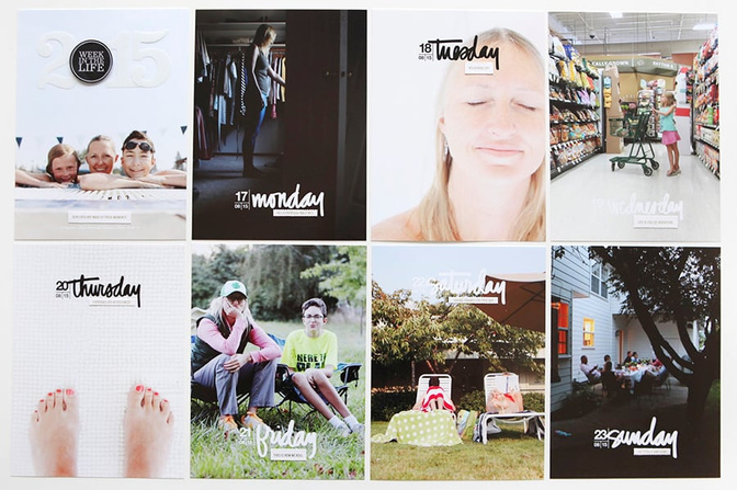
I eased into the "making" of this album yesterday by printing out my main photo for each day first. I like having a full-page 6 inch x 8 inch photo as a "start" for each day. I went back through, selected and edited the ones I wanted to use, placed them in the 6 inch x 8 inch templates in Photoshop (I'm just using a full page vs. the collage option) and printed here at home on my Epson R2000 printer. If you are interested in learning more about working with layered templates check out this post from last year.
After printing out each photo I added one of the perforated strip phrases from the kit.
There are no hard and fast rules for choosing your photos. I rely a lot on my gut - which ones grab my attention, which ones were my favorites from the day, which ones do I want to use full page? I considered having all the start photos for each day be self-portraits but ended up switching that up as I went along.
TITLE PAGE
Here's a look at my 2015 Title Page:
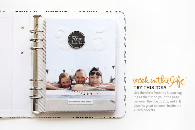
I considered using the 2-inch pocket page as my title page, but came back again and again to this photo. I played around with a few different ideas for a title that would be directly on top of the photo and ended up using the black sticker that was part of the kit packaging (I think I first saw Trisha Harrison using it in the 2-inch pocket page) in conjunction with the white plastic numbers. This means I won't use the numbers with each day of the week as I did last year, but I'm rolling with it. Along the bottom I printed the actual dates and then used the phrase "our lives are made of these moments" from the perforated strip sheet. There is also a "week in the life of us" and a "week in the life of me" included on that perforated strip sheet as well if you'd like to use that on your title page.
To adhere those white plastic numbers I used spray adhesive.
MONDAY START
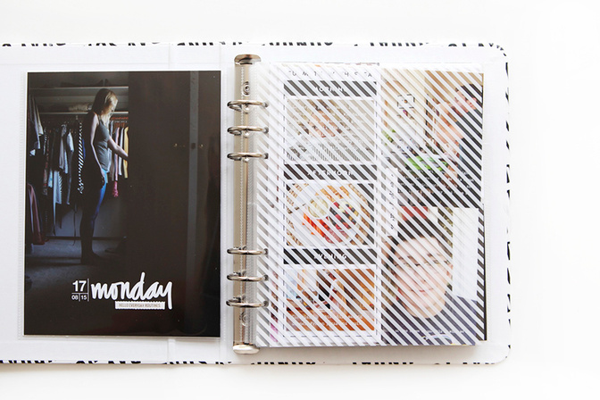
I started adding words directly to my photos and printing them out for Monday. My words are coming straight from my blog posts for last week. I've got all of Monday's photos printed and am currently deciding what to do with a bunch of 4 inch x 6 inch photos that I still want to include but don't have enough pockets for if I follow my own set-up. Last year I adhered those extra photos back to back and punched holes along one edge and added them to the album that way. I'm considering doing that again because I liked the look of it and Mondays are usually the day I have the most photos.
I'll share my completed Monday soon, but in the meantime here's another look at the end of my Monday:
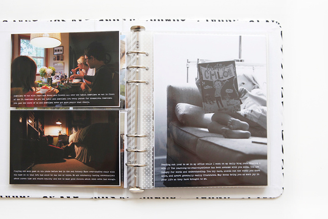
I'm going with a full-page 6 inch x 8 inch photo at the end of each day again as well (the templates include a photo collage option if you want to be able to fit even more photos). I like how it really puts the emphasis on the photos to begin and end that way.
As you can see, I've got my words on the photos and I just need to add some embellishments before calling it good. If you didn't write anything down as you went along last week here's something to consider: Look at the photo and think about what it means to you. What is the story behind the photo? What's important about it? What can you tell me about it that will tell me more about your life or what's important to you or who this person is who was in front of your lens? For the photos of Simon and Anna in the pool on Monday I literally sat here and looked at them and thought about what defines each of them right now and simply wrote that out (you'll see those images and words when I share my full Monday collection).
I'm using the font Remington Noiseless (same as last year) in 9 pt type or smaller.
For more Week In The Life™ posts check out my archives here.


Comments
Sign in or sign up to comment.
74 comments
Looks great, Ali. I love how you used the 6x8 morning, afternoon, evening card to hold pictures. I wasn't keen on using them for words, but now have a much better option. Can't wait for a video walk-thru when you're all done. :)
Replies to icequeen
Sign in or sign up to reply.
I saw all these portrait photos and kind of smacked myself on the head because I should have decided up front that I wanted to do my album this way and made sure my first photo of the day was a portrait shot with my DSLR. I am able to crop mine to 6x8 since the file is so large (even though they're landscape) which is what I'm assuming you did but I'm having trouble because I naturally want to make the first photo of the day be the opening shot. How do you deal with that? Isn't your story out of whack if the big photo isn't the first photo of the day? Explain. :)
Replies to TracieClaiborne
I totally don't worry about it - seriously. My opening photos, as you can see from the image above, are not all the first thing that happened that day - rather they are just ones I like and want to have be the larger size. I figure that I'm still keeping all Monday together but I'm not bound by having it to go in certain order. I shoot all horizontal - I think there were two shots this week that were portrait. I just make them work.
I was at a workshop yesterday about teaching writing to kids and the presenter emphasized that we are trying to get them away from "bed-to-bed" stories (because, yawn)---every time I've tried to put together my album from last year I get a little bogged down with all the the info, and that idea from the workshop helped me see that the way Ali does the WITL album it avoids that bog--she manages to use the framework of a day and a week to tell little stories that are not bed-to-bed at all. They are pieces of a mosaic and each piece is there for some reason, and the result is so powerful. I just wanted to share in case that helps any one else.
That is such a great way to describe that @ktber - thank you.
Sign in or sign up to reply.
Hi Ali. I'm so excited to see you have started your album and sharing. It's 7am here in Australia. I've been checking every morning as soon as I wake up!!!
I have a question about adding words to the photos. My big camera seems to take great pics but they are at 72dpi do I need to change this to 300 dpi before I can write on the photo?? Sometimes the writing turns out really small so I'm thinking this is why. When I do change to 300 it makes the photo so large though.
Replies to photoaddict555
Good question! I resize to 300dpi (4x6 or 3x4) and then type on my photos.
When the photo gets large you just need to use the magnify tool to make it smaller on your screen.
Sign in or sign up to reply.
I. Just. Love. This. Project.
THANK YOU for motivating me each day and extra THANK YOU for the ideas and suggestions about how to put it together. For people like me, who really want to be creative but aren't, this is perfect.
Love it.
Replies to suzieandrocky
Sign in or sign up to reply.
There's not one thing you do that I don't love! This is awesome!
Replies to Bellaa75
Sign in or sign up to reply.
Is it possible to change the dates on the new Week in the Life No. 2 layered templates? If so, how? I watched last year video again, & the dates/days of the week are each on their own layer. Help! Thanks!
Replies to ScrapNSplash
Hi - yes. You can use the eraser tool or the rectangle marquee tool to select and delete the date. Make sure you have the Word Art layer selected and then draw a box around the number you want to remove. Hit delete. Then you can type in your own date on a new layer. I used Helvetica Neue as my font but you can use whatever you'd like.
This is exactly what I wanted to ask since I am doing WITL this week. Thank you!
Seriously you are so helpful Ali!! I'll be "studying" how to do all this tonight. I need to go to best buy and get a booster so I can watch all the videos outside haha :-)
Sign in or sign up to reply.
It looks amazing! Can I ask how you changed the words to white? I'm new at this Photoshop thing and have managed to make the layered templates thing work, but I would love to know if changing the colour is an easy fix?
Replies to sheridan
How I do it is:
1. Create a new layer directly above the words
2. Use the "bucket" to fill that layer white (your entire page should turn solid white at this point)
3. In the layer pane where you see all the layers listed, right click on the solid white layer
4. Select "create clipping mask" and it should change the text white.
For any other color, just fill with that color instead of white :)
There are so many different ways to do it! I would select my type with the T tool (select the T tool and then click on your words and drag to select the area you want to select) and then click on the foreground color box and click on white (or just select white from the swatches palette).
Thanks so much to both of you! I'm going to give this a try today!
Jessica Sprague has an awesome and only $8 beginners class. I flew through it, two evening (only a couple hours, thats with littles haha) I highly recommend it. You have it forever too and theres PDFs. :)
Sign in or sign up to reply.
Just a question on fonts - what's the best one and what size do you use? I love your blog it's my home page and it inspires me each day!! Thanks Ladiess
Replies to kahmah
I don't think there is a "best" one. For my journaling in this project I'm using Remington Noiseless (a typewriter font) in about size 8pt. I like small type and I can fit more words in that way.
Sign in or sign up to reply.
I propose a GIANT giveaway... Where You, Ali, come to my home and live for a week and capture my life for MY "Week in the Life Project". I've attempted this project several times and just can't seem to get it right. I look at my pictures at the end of the week and it's always disappointing. I LOVE the idea, and your photos and stories are so perfect. People say things to me like- your life is exciting, interesting, or reality show worthy. Either the people I know just live really boring lives or I'm doing a very bad job representing this in my photos for this project!
However, you have inspired me to paint my entire house white/off white, for better lighting conditions!!
Replies to deniseweatherby
What does it mean to "get it right"? Sounds to me like you might be too critical of yourself and your project - aiming for "perfect" when that really doesn't exist.
Sign in or sign up to reply.
Ali, for those of us who love your style but maybe want to stretch out the time period covered in our albums, would you consider making a new digital product with the months of the year instead of the days of the week? I love the look of the days of the week in this set and would love it even more if you did the months of the year. I know you have some products with a shortened version of the month (Jan, Feb, etc.), but I would love to have the whole month spelled out in a similar style as this year's WITL products!! That would be awesome!
Replies to toobusymama
Sign in or sign up to reply.
On the numbers for the dates, what font did you use? I am having a hard time trying to find one close to what you used. Thanks!
Replies to vlongoria13
Sign in or sign up to reply.
Ali, can you tell me why your photos are so bright (and white)? I work in PSE and have an Epson R8100 printer. My photos are beautiful when printed but lack that brightness that yours has. I notice that some of yours are mostly white with just a hint of color. Please tell me how you do this. Thanks!
Replies to Ruann
Sign in or sign up to reply.