Weekend Creative : February #5 : Ad Inspiration
Tags:

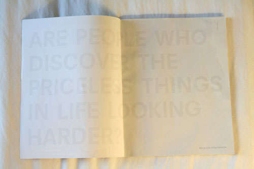
I opened up my new issue of Domino magazine today and saw this ad.
The text reads: Are people who discover the priceless things in life looking harder?
A couple observations about this ad:
1. It grabbed me because it looked blank. No photo. No supporting text. No color.
2. I had to look twice to read the type + then had to squint hard to read ©2008 Mastercard.
3. I really like the look of the very light grey on the white. I love white on white.
4. I love the oversize type that stretches across both pages.
5. I applaud the sparseness. So many ads try to stuff as much as possible into the space.
Here's the prompt for this weekend: Take inspiration from this ad and create something with it: a scrapbook layout, a canvas, a photograph. Maybe you'll take away the inspiration of white on white (or a color on top of the same color), maybe it's the oversize type that stretches across a spread, maybe it is a layout without photos, or maybe it is the idea of discovering the priceless things in life. Take something from this ad and make something of your own.
And in case you'd like to share your weekend creations with others check out the Flickr weekend creative group.


Comments
Sign in or sign up to comment.
42 comments
Just made something refreshing with this same concept this past week...felt SO nice and simple and meaningful. Thanks for your blog, love it!
Replies
Sign in or sign up to reply.
I'm so inspired by this I almost can't stand it! thanks, Ali.
Replies
Sign in or sign up to reply.
Interesting that they typed "discover" in the ad. Great inspiration...although wish it wasn't from a credit card company LOL! Not a fan...they will try to reel you in any way they can!!! (Dave Ramsey fan..hee hee!)
Replies
Sign in or sign up to reply.
I loved this ad as well. Like you, it struck me because it was so simple. In a time when ads are all about loud music and tons of color, it was nice to see something more plain and stark.
Replies
Sign in or sign up to reply.
Love the ad too. Loved the observations by a couple of people about Mastercard making their name so small and 'Discover' so big. When it comes to creating, sometimes I get so many ideas in my head that they bottle-neck and I can't seem to put one into action. Anyone else get that way? If/when I get my thoughts sorted out I'd like to try this. Thanks for the continuing inspiration. Hope you're having/have had a nice time at CKU :)
Replies
Sign in or sign up to reply.
ali, i so enjoy reading your posts. love the ad in this one, just proves simplicity is best.
also in response to the 2/27 blog i wanted to link you to this site of goodness. this is an incredible gift that is given by many professional photographers to families in their time of greatest sorrow. warning! very emotional content.
http://nowilaymedowntosleep.org/
Replies
Sign in or sign up to reply.
Wow this is a great ad. It really captures your attention. Definitely supports the "less is more" philosophy. I'm definitely going to take up this challenge. So many different ideas i want to try based on this ad, though I must say, I do love the idea of trying white on white, I tried white on cream on a layout once & I loved how it turned out
Replies
Sign in or sign up to reply.
Just love it! Know exactly what to do with it, too bad I can´t make it until next weekend...
Replies
Sign in or sign up to reply.
what a beautiful ad! thanks for the inspiration, Ali! hope everyone is well in the Edwards household!
Replies
Sign in or sign up to reply.
this is soooooo fun.
I played around with a picture and had a blast, because you inspired me.
you can see it at...
www.moredoors.blogspot.com
thank you !!!
Replies
Sign in or sign up to reply.
Ali,
Another amazingly inspiring prompt for this week-end - it was just the quote I needed to get a layout out of my head and on to paper (posted on your flickr w/e group - under lee3bat). Also loved the punch picture. I've made several and we raffled one off at a charity crop and it was a HUGE hit - gave you all the love and credit of course and I'm sure you have a few new blog readers too as a result. Just love everything you do - thanks so much for being so generous with your time and creativity!
Linda B
Replies
Sign in or sign up to reply.
OK -- tried this one out -- not sure about the success, but it sure was fun! It was a bit outside my comfort zone -- and I found myself forcing myself to leave things off.
As always, these challenges have become one of the best parts of my weekend.
Thank you, thank you....
You can see the results here (http://lynlepre.typepad.com)
and in the flickr group.
Replies
Sign in or sign up to reply.
Feeling very warm and fuzzy this morning...and wanted to say 'thanks'...for all that you give...there is rarely a day that I don't come here and feel inspired. here's a blog hug!
Replies
Sign in or sign up to reply.
This is good. If only all clients were as brave and flexible enough try something like this.
Replies
Sign in or sign up to reply.
That caught my eye, too!
I've done many white on white projects...can't beat it...very classic!
New items at my etsy shop...just in time for spring (baby and homegoods)
www.scrapsnthings.etsy.com
Replies
Sign in or sign up to reply.
I will definitely be doing a LO on this! Thank you for sharing this ad! (I love Domino!) :)
Replies
Sign in or sign up to reply.
Really cool ad, A. I don't think I am going to have any time to do anything tonight, but I will add this to my idea file. I remember one layout you did a while ago (about your bedroom, I think?) with a white on white title and thinking, "I never would have thought of that!"
Anyway, I owe ya an email. Hugs -
Replies
Sign in or sign up to reply.
I was so inspired by this ad you posted. What a great prompt. Here is my version of the ad in a layout!
http://ecoscrappermom.blogspot.com/2008/03/weird-and-strange.html
Replies
Sign in or sign up to reply.
I love it! Very clever and creative! I love those Mastercard adds! Just did a layout inspired from them, recently.
Replies
Sign in or sign up to reply.
Ok, finally my project is done. I chose black-on-black for a series of canvases. It´s hard to figure out from the picture, but the text is "home is where the heart is"
http://yngla.blogspot.com/2008/03/det-lilla-canvasprojektet.html
Replies
Sign in or sign up to reply.