Weekend Creative : February #5 : Ad Inspiration
Tags:

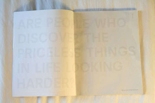
I opened up my new issue of Domino magazine today and saw this ad.
The text reads: Are people who discover the priceless things in life looking harder?
A couple observations about this ad:
1. It grabbed me because it looked blank. No photo. No supporting text. No color.
2. I had to look twice to read the type + then had to squint hard to read ©2008 Mastercard.
3. I really like the look of the very light grey on the white. I love white on white.
4. I love the oversize type that stretches across both pages.
5. I applaud the sparseness. So many ads try to stuff as much as possible into the space.
Here's the prompt for this weekend: Take inspiration from this ad and create something with it: a scrapbook layout, a canvas, a photograph. Maybe you'll take away the inspiration of white on white (or a color on top of the same color), maybe it's the oversize type that stretches across a spread, maybe it is a layout without photos, or maybe it is the idea of discovering the priceless things in life. Take something from this ad and make something of your own.
And in case you'd like to share your weekend creations with others check out the Flickr weekend creative group.


Comments
Sign in or sign up to comment.
42 comments
This is a cool ad. My son thinks it is dumb. He is color blind and cannot see anything on the pages. I just wonder if the company who made the ad had ever even thought about that. I believe that 1 in 8 men are color blind. That is alot of people not seeing an ad. But as one who can see it, it is pretty cool.
Replies
Sign in or sign up to reply.
Thanks Ali, this was just the inpsiration I was looking for while working on a Baptism layout. I wanted to keep the layout clean and fresh because it's a "first" for my niece and she is starting anew.
So here it is.
http://jennifermartinovici.typepad.com/crazyjen/2008/03/gracie-layouts.html
Replies
Sign in or sign up to reply.