Weekend Creative : February #5 : Ad Inspiration
Tags:

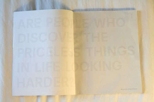
I opened up my new issue of Domino magazine today and saw this ad.
The text reads: Are people who discover the priceless things in life looking harder?
A couple observations about this ad:
1. It grabbed me because it looked blank. No photo. No supporting text. No color.
2. I had to look twice to read the type + then had to squint hard to read ©2008 Mastercard.
3. I really like the look of the very light grey on the white. I love white on white.
4. I love the oversize type that stretches across both pages.
5. I applaud the sparseness. So many ads try to stuff as much as possible into the space.
Here's the prompt for this weekend: Take inspiration from this ad and create something with it: a scrapbook layout, a canvas, a photograph. Maybe you'll take away the inspiration of white on white (or a color on top of the same color), maybe it's the oversize type that stretches across a spread, maybe it is a layout without photos, or maybe it is the idea of discovering the priceless things in life. Take something from this ad and make something of your own.
And in case you'd like to share your weekend creations with others check out the Flickr weekend creative group.


Comments
Sign in or sign up to comment.
42 comments
I love this idea. I will definitely use this as inspiration for a painting.
Replies
Sign in or sign up to reply.
oooooo Love it!!! I'm going to have to give this a-go!!!!
Thanks Ali ^-------^,
-Karla
Replies
Sign in or sign up to reply.
http://stationery.blogs.com/stationery_scoop/
you are so inspiring...i came across this site in a blog hunt and couldn't help thinking of you...
INGENIUS!
Replies
Sign in or sign up to reply.
i saw that ad too, in wired magazine. it's definitely an eye-grabber.
Replies
Sign in or sign up to reply.
I just saw this yesterday and went "WOW"!
Left the mag open to that page and didn't go any further...left it sitting on my desk....so thrilled to see the photo of it in your blog this morning!
Simply beautiful!!!
Replies
Sign in or sign up to reply.
Ali,
I love this ad.
I love white.
My future bathroom will be ALL white.
There's something so clean and fresh about it.
Can't wait to see the new Domino.
See you soon!
Jessica
Replies
Sign in or sign up to reply.
Hey, Ali, IllustratingStories.com issued a challenge to take a photo an hour for a whole day. I blogged about it here:
http://www.paperclipping.com/2008/02/28/a-photo-an-hour-challenge/
I did it yesterday with the idea to do something similar to your 365 project. I wanted to take photos of the things I was doing every hour, trying to fit at least a little of myself into each photo. Thanks for inspiring me with all your timed photography. It's so interesting to do this type of thing. Here is my flickr page where all my photos are (still need to upload the last few):
http://www.flickr.com/photos/noellhyman
Just wanted to share!
Replies
Sign in or sign up to reply.
yup, that ad is yummy. Nice prompt. thanks! :)
Replies
Sign in or sign up to reply.
Thanks for the Domino link! I signed up for their newsletter!!
Hope all are well at your house!!
Replies
Sign in or sign up to reply.
that is such a cool ad! Love everything about it.
Replies
Sign in or sign up to reply.
Neat ad. However, I am a little surprised that Mastercard put their name in miniscule type, while printing the word "Discover" in huge type, lol!
Replies
Sign in or sign up to reply.
Love Domino!
This ad also caught my attention - very cool.
Thanks for the inspiration!
A.
Replies
Sign in or sign up to reply.
Ali,
Thank you so much for the Weekend Creatives! I love them and have had so much fun with the projects. Thanks for the inspiration and the time you put into these things.
Replies
Sign in or sign up to reply.
Yip! these creatives are GRAND!
... and as for w/w (white-on-white), it's unbeatable for beauty.
... the ultimate simplicity is a breathtaking challenge...
Just added an oldie to flickr.
Tx!
Replies
Sign in or sign up to reply.
yes, something about white on white is so refreshing and crisp. when i'v decorated with it, i found the shadows and lines of white on white create their own texture.
great ad and inspration, thannks!
Replies
Sign in or sign up to reply.
is it just me or is it ironic that a mastercard ad uses the word discover so large in the ad but you can barely read the word mastercard?!
Replies
Sign in or sign up to reply.
Thanks for the inspiration...
just what I needed!!
http://www.tangiebaxter.com/gallery/showphoto.php?photo=414&ppuser=2
Replies
Sign in or sign up to reply.
I blogged about my inspiration piece. Thanks for inspiring me!
Replies
Sign in or sign up to reply.
Got mine too and did a GASP when I saw it as well. Very well done! That whole magazine inspires me to no end!! LOVE IT SO MUCH! I will be taking on this challenge for sure...gotta fit it in this weekend. Hugs Ali!
Replies
Sign in or sign up to reply.
WE are so blessed to have YOU inspiring US each weekend, and most every day. Just know that you touch so many lives, in a single day, in such a grand way. I am greatful. God Bless, KD
Replies
Sign in or sign up to reply.