December Daily® 2023 | Special Guest Kristin Ladstrom
Tags: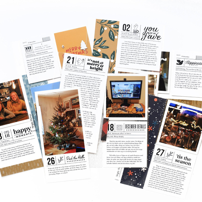
COHESIVE JOURNAL CARDS
When I first made the digital mockup of my album (see my last post!) I realised I wanted to simplify my design choices. The easiest way for me to do that was to come up with a black and white journal card design that I could repeat throughout the album, but still add variations to. I was inspired by a digital stamp set I had, Quarantine by In A Creative Bubble for Studio Calico, but I needed something similar that I could use for 4x4 and 4x8 cards. So, inspired by that design, I created my own journal card design by drawing a few black lines in Photoshop.
My card has ... + a number in the top left corner (the font is Bebas) + two spaces for digital stamps (one illustration + one wordart). I have many, many new and old sets of digital stamps designed by Geralyn Sy, so I could switch out the digital stamps to add variation, while keeping the design cohesive (also - not all the illustrations I used are from Christmas sets!). If you want to keep your design cohesive without having to think much about it, I’d recommend sticking to one designer, but you could of course mix and match as well. + rows to add "place" and "feeling"
As you can see in the examples, some of the wordart files I used were a bit taller than others, so then I "cut into" the "place" and "feeling" rows to fit it in nicely. This was a personal preference but is totally not necessary if you're not a nerd about shapes and spaces in design. :)
Most of the cards are 4x4, but I made some other sizes too to fit specific stories I wanted to tell - one 4x8 with space for a tall photo, one 4x8 with space for lots of words and one 4x8 with space for physical embellishments as well (since I knew I didn’t have any other photos or words to go in that space for that day).
All in all, I love how this turned out - simple but versatile! I found this concept so easy and fun to use. I'm definitely doing a similar journal card design this year (or maybe I’ll use the same), even though I'm hoping to make a "craftier" album with more interactive pages this year.
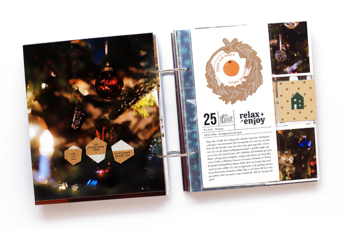
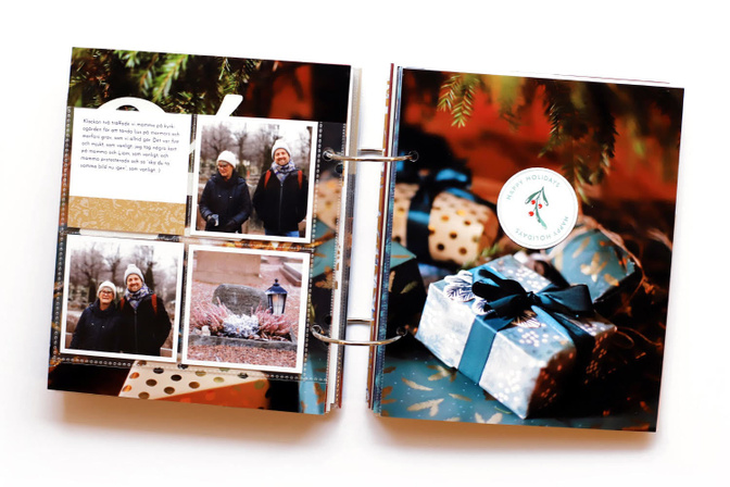
FULL PAGE PHOTOS WITH MINIMAL EMBELLISHMENTS
Another simple concept I decided to stick to to make this process easier was choosing full page photos, and then embellishing each page very sparingly. A trio of matching embellishments here ... a small pocket with a number on it and journaling tucked inside there ... and often just one single embellishment on a page - that was both doable and fun for me, so that's what I did! It's not rocket science, I know - but I think I needed to remind myself that I'm "allowed" to keep decorations minimal. (Give yourself time to think about what you could simplify to make this process doable for you.)


Comments
Sign in or sign up to comment.
3 comments
Lovely pages and full page photos. Full page photos are a fave of mine. Thank you for sharing your ideas!
Replies to justlisa
Sign in or sign up to reply.
Congrats on finishing your album from last year, Kristin. I’m so impressed you took the time to do it months later. Thanks for the thorough details on how you mad this huge project work for you and the time you had. And the reminder to keep the joy.
Replies to blurooferika
Sign in or sign up to reply.
Well, funny thing — I wasn’t even planning to gamble, but boredom led me to spin mama and now I’m kind of hooked. Tried “Mystic Temple” and lost for a bit, but then upped the stakes and finally landed a huge win. What’s cool is they have tailored promotions just for players from Greece, which gave me a nice boost starting out. Definitely added something exciting to my usual routine.
Replies to jonsen
Sign in or sign up to reply.